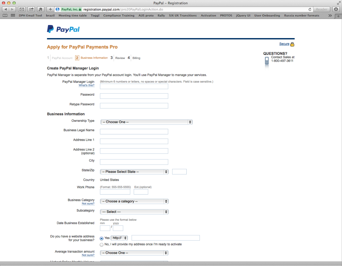
A constant challenge for the business sector was the product, PayPal Payments Pro. The problem arose when PayPal acquired VeriSign and tried to integrate, but were only able to get half way through the integration process because of two conflicting APIs. Both the business dev team and designers were faced with a major design challenge. The projected outcome was to create one flow that consisted of two data form Applications.
Design an experience that is both functional and aesthetically pleasing. This flow would combine both signup processes into a user-friendly environment retaining user attention, minimizing drop off rates to allow the users to experience the core benefits of PayPal Payments Pro.
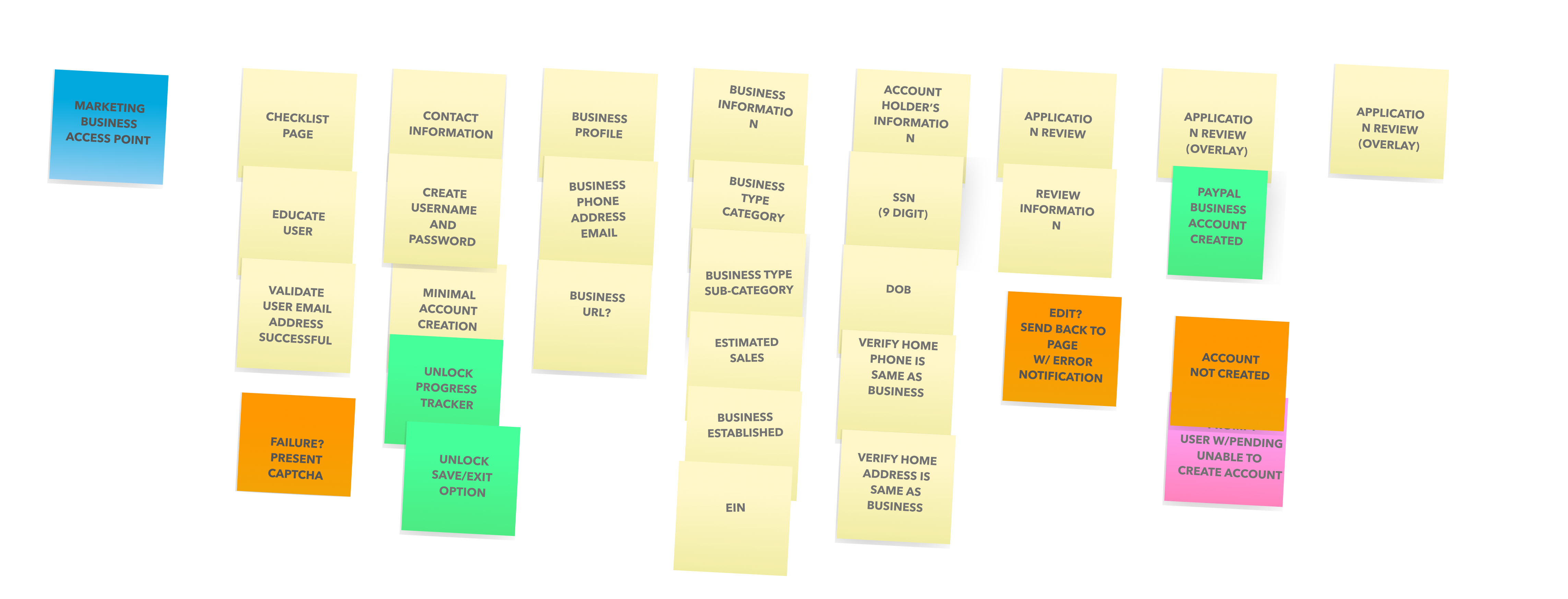
This being a Business Dev project the design team initiated and collaborated with Biz-Dev, marketing / Sales, Content writers, product managers, producers and engineering for the execution of the project. The need, conceptualization and the implementation plan were chalked out and were presented to all the stakeholders. We worked in Agile and Lean UX, so using post it notes to roughly layout requirements and a rough flow helped with the alignment of the team.
Collaboration and alignment of our projected goal was an important step within this process. Next we would move onto research with users who are business owners and uncover the pain points of trying to signup and upgrade also educate them on why they should upgrade to a PayPal Payments Pro account. It was important to capture all the data that would be needed in both flows so we wouldn't miss any of the crucial information needed to vett the users stepping through this experience.
Before flow was mapped out it was important to do some research with our end-users to try and discover the pain points that they were experiencing. So we set up a series of User testing in the lab and observed the interactions of both frustrations and the small successes.
After conducting the research we wrote down what was working and what wasn't-our key takeaways. The results from this experiment showcased the reasoning behind the high drop-off rates that PayPal was encountering within this experience, and supported the teams rationale behind designing a better more cohesive user experience.
Compiling all of our insights and requirements for our signup experience we started the process of mapping out the unified flow.
As we started this process we thought about all the data we gained from our user testing sessions. We observed that users needed to have a better understanding of preparation, key benefits and the duration of time it takes to signup.
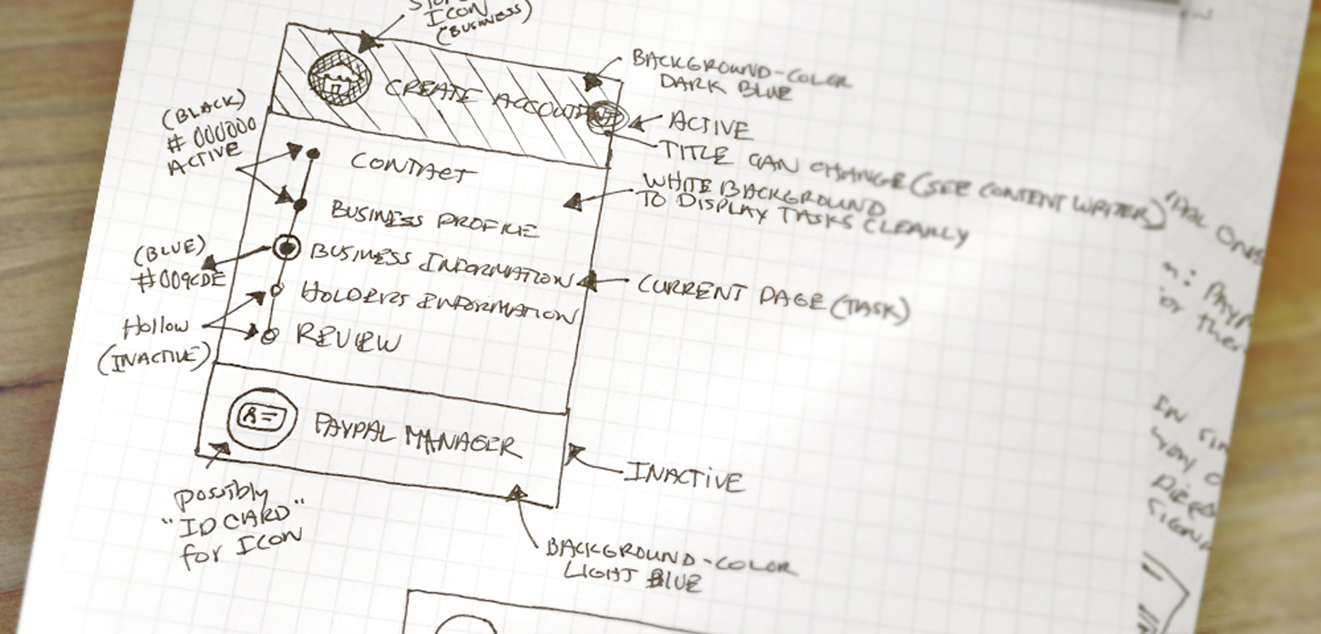
I started to do some sketches and conceptualizing ideas around keeping the user engaged because duration of time and drop-off were two major challenges we had to solve.
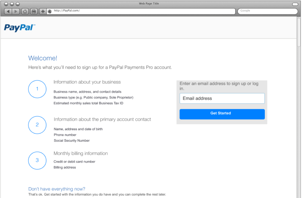
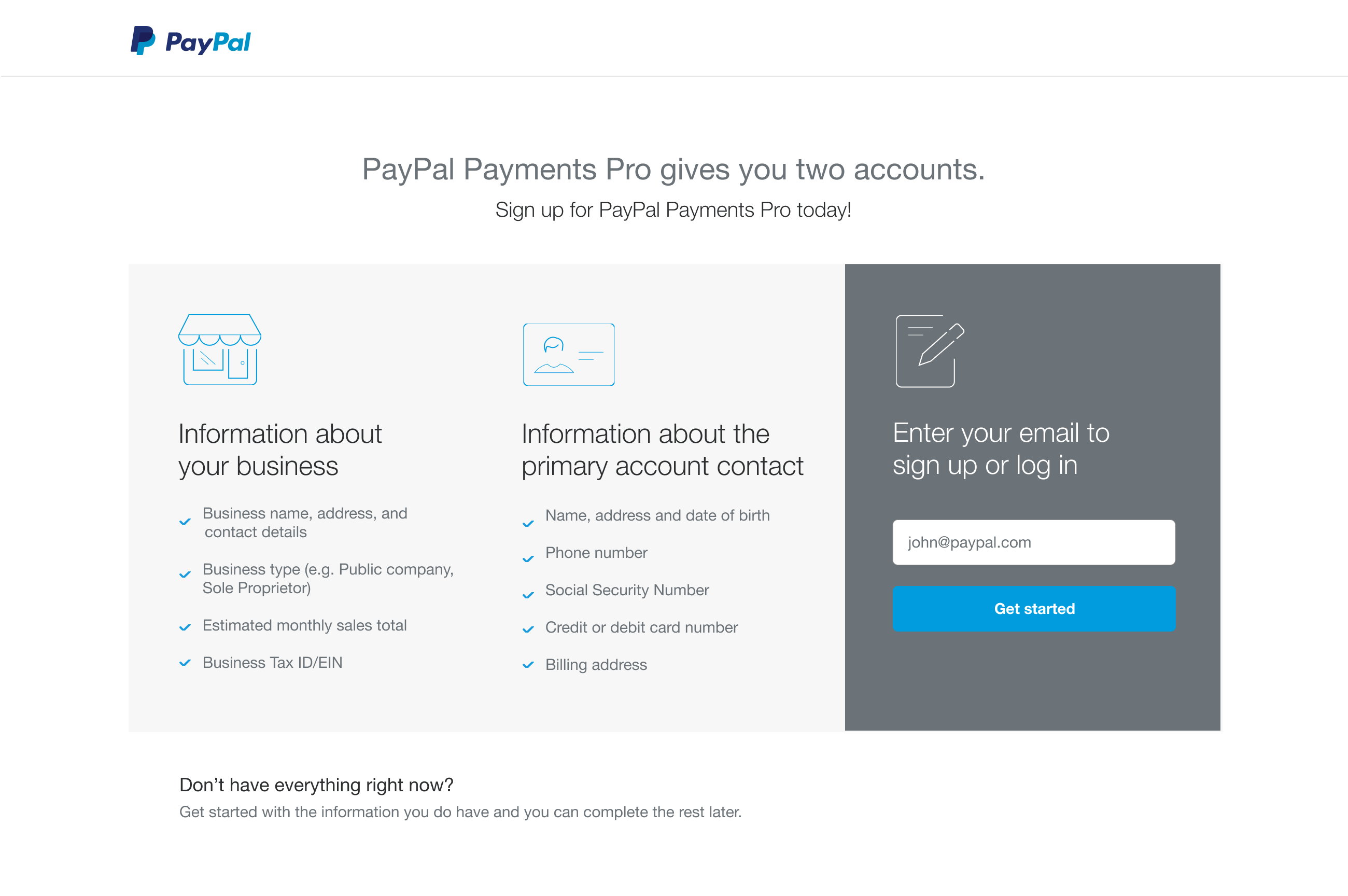
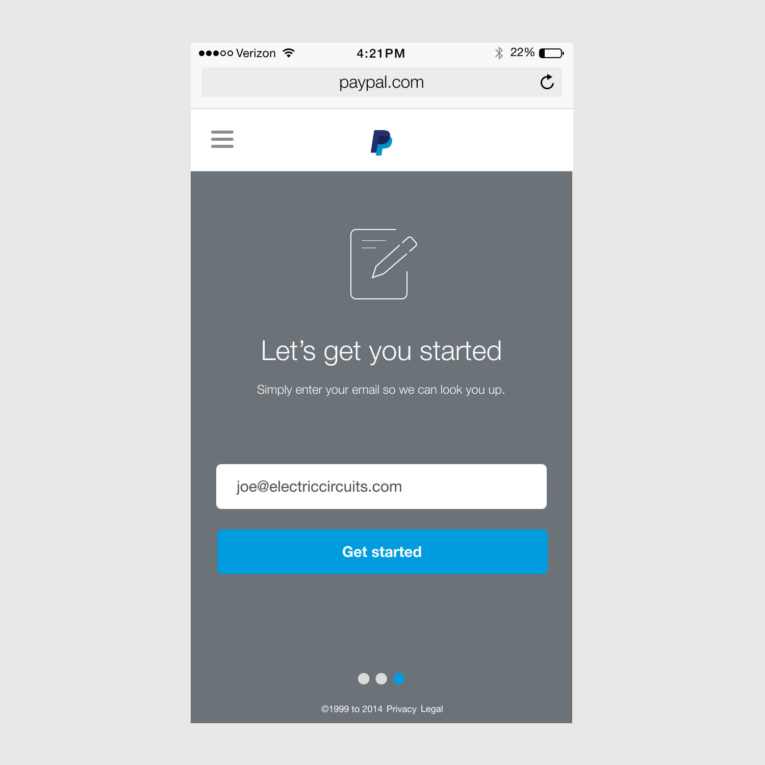
I also wanted to make sure the design educated the user at the front door, so they were well prepared to provide all the information. Again, one of the business goals was to not waste the users time and empower them to finish the signup process so they could upgrade their account.
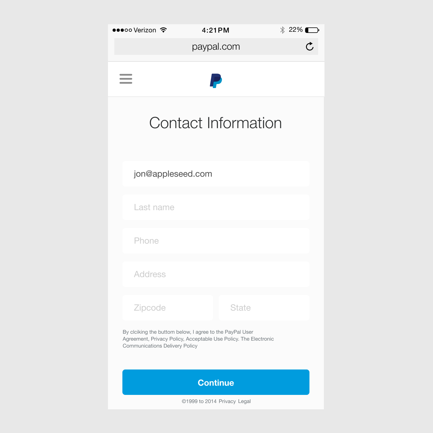
With a stepflow concept sketched out and defining each step, I began to work with another UX designer collaboratively to start designing each page and all the requirements for those pages. We also simultaneouly worked on the patterns for the input fields, regular expression notifications, error messages, step pattern interactions etc.
This part of the process defined the functionality and flow of all the minor nuances and details that would be needed to validate our users. We also began documenting all the interactions and states for all the components being used within this experience. We then pressure tested within the eternal team to make sure that everything was captured correctly. Once the flow was validated with all stakeholders, we built a rough lo-fidelity prototype to once again user test.
During this process, I began to implement the visual language to all the pages and integrate new and existing patterns. I defined and created rules around typography treatments, colors and grid, so the pages had rhythm. I also specified the spacing and breakpoints for the experience based off the most common screen sizes / devices.
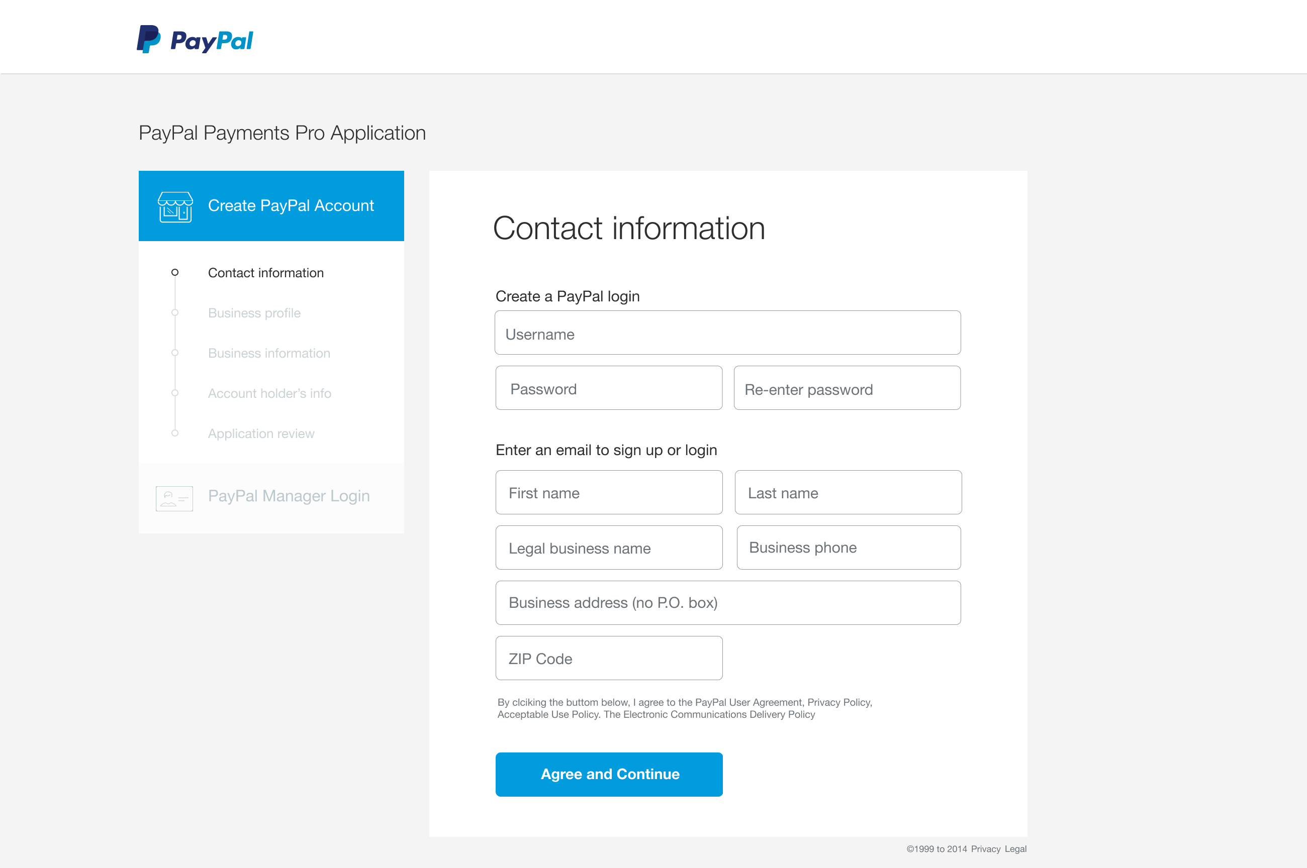
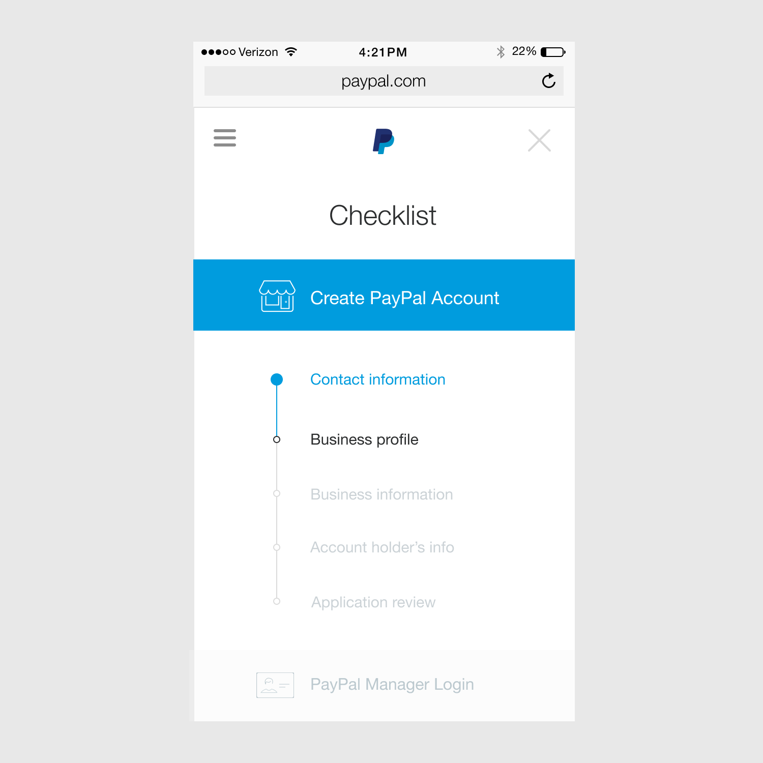
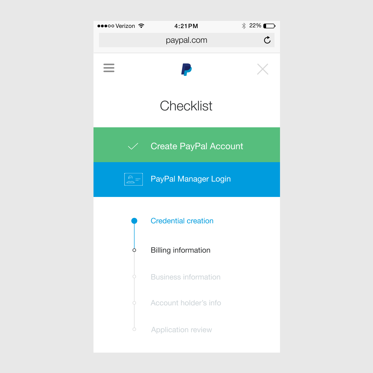
One main component was the progress tracker. This pattern allowed for the user to be able to know where they were in the flow, what they needed to complete and what they had completed.
It also acted as a navigation device so users could skip around, but only after they completed the first page which was the minimal account creation page. This allowed the team to capture the users data in the early parts of the flow which had led to higher conversion
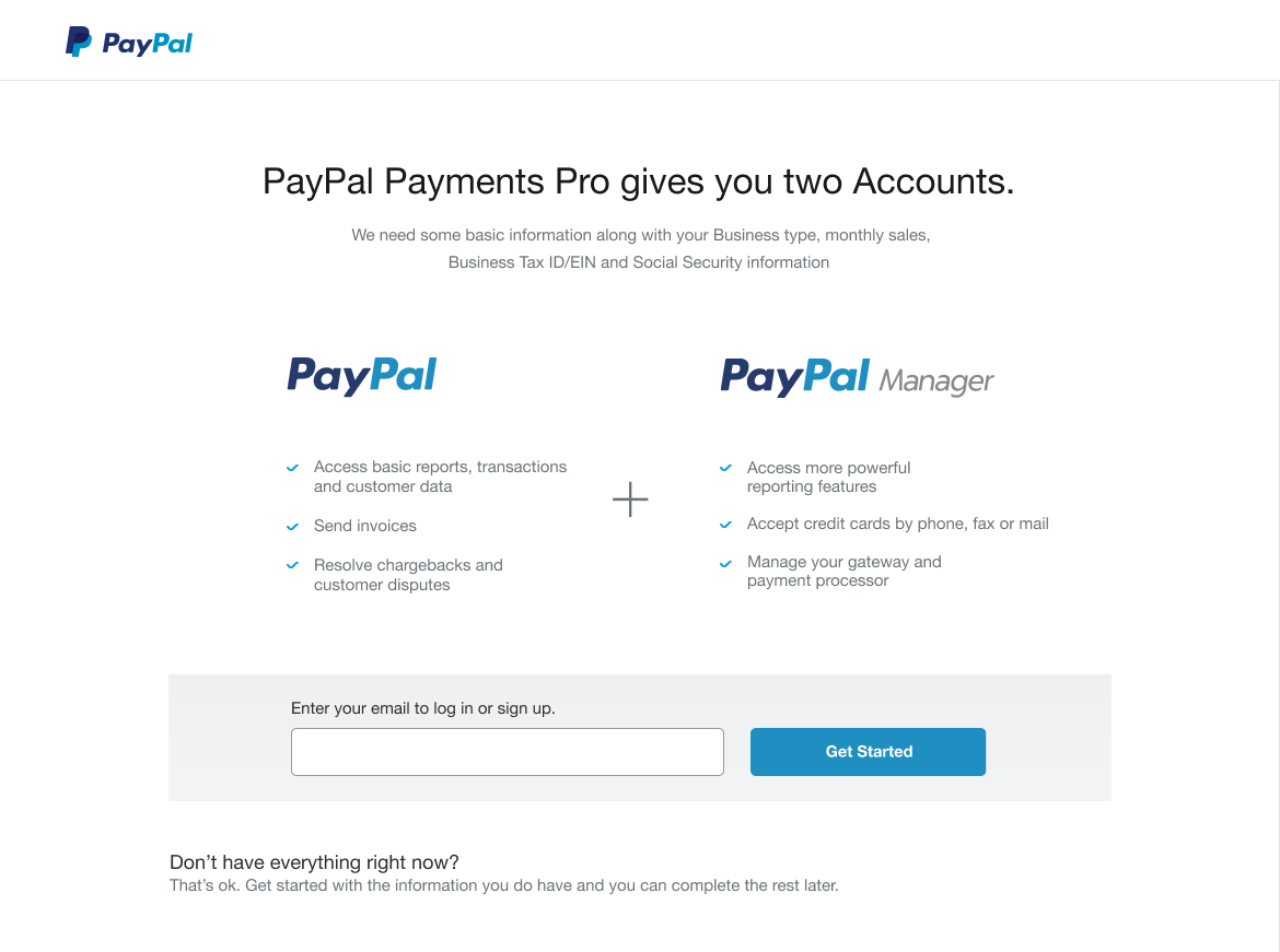
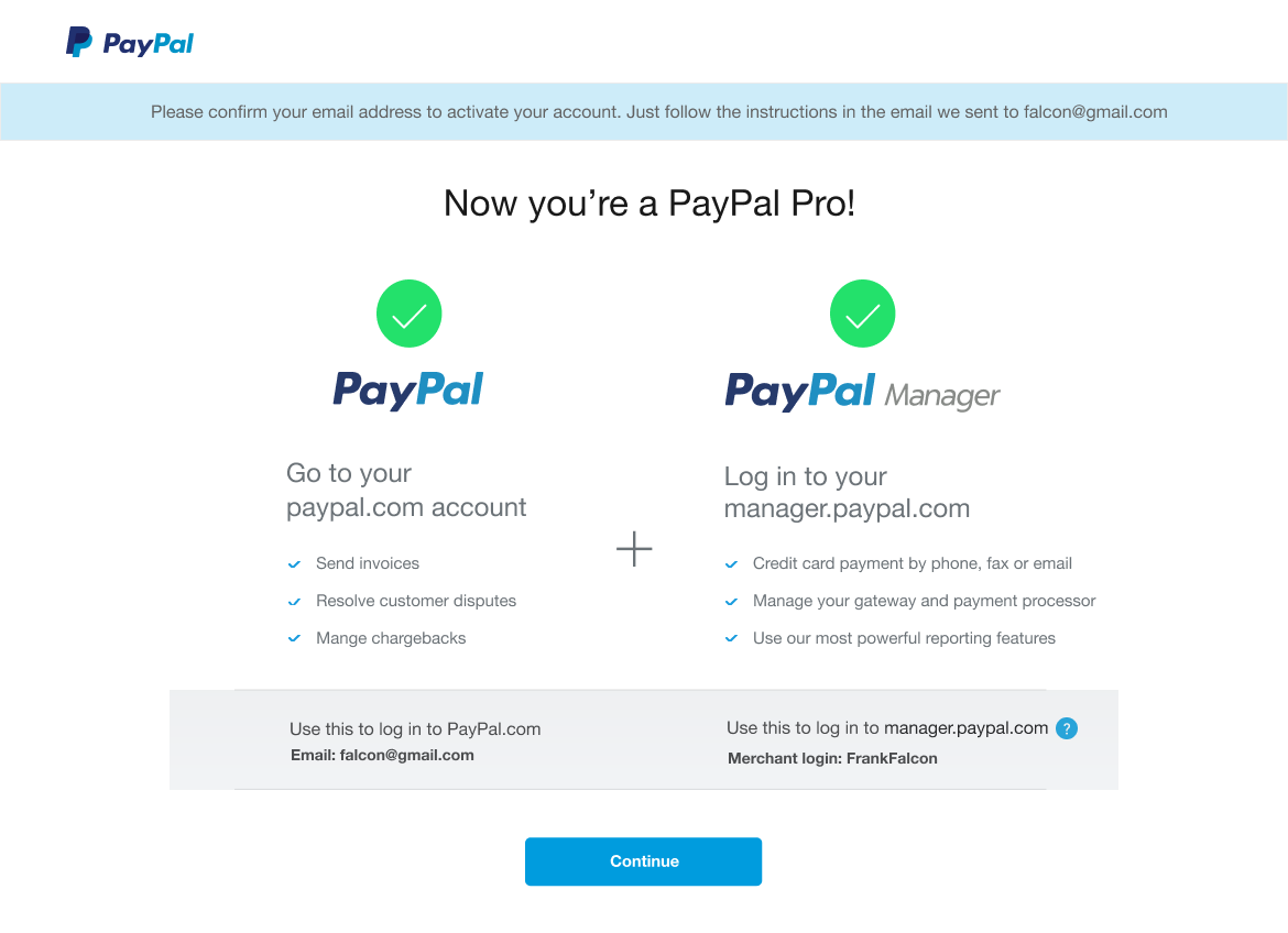
Content was also important and I worked closely with the content designer to deliver the right message and educate the user by explaning the benefits of a PayPal Payments Pro account and that the user will be creating two accounts which make up the Pro account.As I was designing the experience for web, I was taking into consideration what the adaptive mobile experience would entail. By thinking about the simplicity of a mobile first experience it removed the complexity and create a simpler approach to solving these design challenges
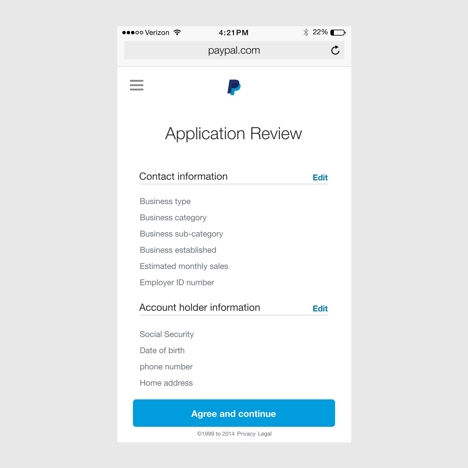
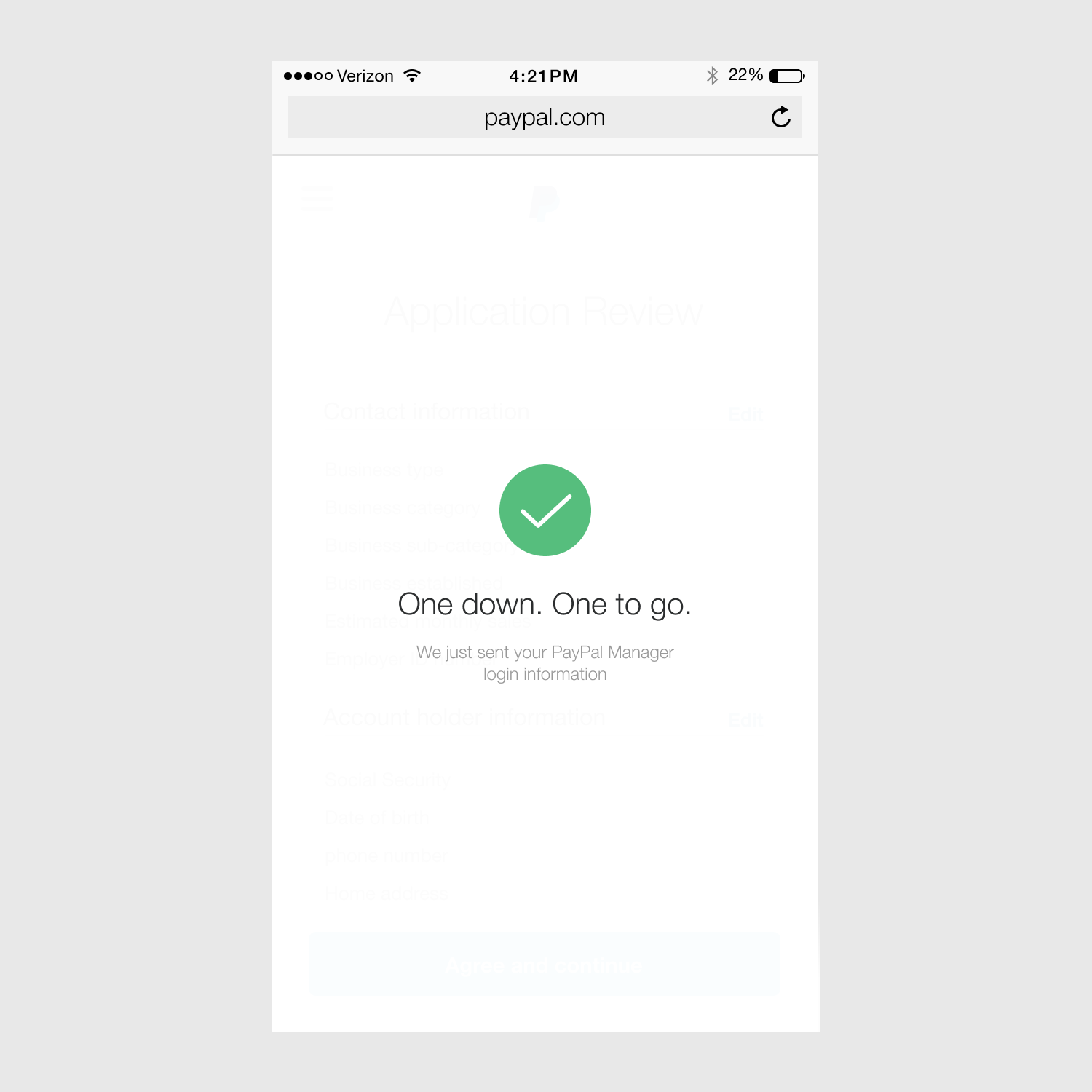
So based off our findings when testing the hi-fidelity prototypes on both mobile and web, we received the same data around the users not understanding what they were getting before going through the signup experience. So we had to to pivot and change the design not only on the validation screen but also the summary screen to reassure users of the PayPal Pro customer benefits.
The step flow pattern worked ven better because we also had to consolidate some of the pages so there were not as many steps in the signup process.